Picking a wardrobe color palette that you will actually use is less about following trends and more about solving daily dressing problems: what to wear when you have five minutes, how to make pieces mix without forcing yourself to think about color, and how to buy smartly for a small shop so customers can see how garments pair. This guide gives concrete steps, trade-offs, and outfit examples for US women who prefer practical, vintage-inspired everyday clothing — and for independent boutique buyers deciding which colors to stock. Wherever you shop or buy wholesale for resale, remember that website orders are handled by email requests with availability, shipping, and payment terms confirmed in writing; wholesale prices, minimums, and lead times are supplied on inquiry through our wholesale channel.
Start with a Neutral Backbone
Every reliable color palette begins with neutrals you will actually wear. For vintage-inspired wardrobes, think beyond stark black or pure white: deep navy, warm camel, charcoal gray, and cream are practical and photograph well in shop displays. Choose two to three core neutrals — one for bottoms, one for outerwear, and one that reads as a light base.
- Example everyday setup: charcoal skirt, cream blouse, warm camel coat.
- Shop buyer tip: stocking two neutral hues across fabrics (e.g., cotton twill skirt and wool coat in the same camel) increases mix-and-match potential without multiplying SKUs.
- Trade-off: very-muted neutrals can look flat in warm indoor lighting; add texture (corduroy, velveteen, or knit) to give life.
Choose One or Two Accent Colors
Accents make outfits sing—used as blouses, scarves, or small accessories they prevent a wardrobe from feeling monotonous. For a vintage-inspired look, russet red, moss green, mustard, or teal are classic choices. Limit yourself to one or two accents in whatever saturation you wear most often: muted or bright.
- Outfit idea: charcoal trousers, cream tee, and a retro red velveteen shirt for a daytime, slightly bohemian vibe.
- Trade-off: bright accents demand restraint elsewhere; if you pick a vivid teal, keep prints small or neutral to avoid clashing.
- Retail note: order accent colors in smaller quantities than neutrals to test sell-through before committing to large reorders.
Pick a Pattern Palette That Plays Well
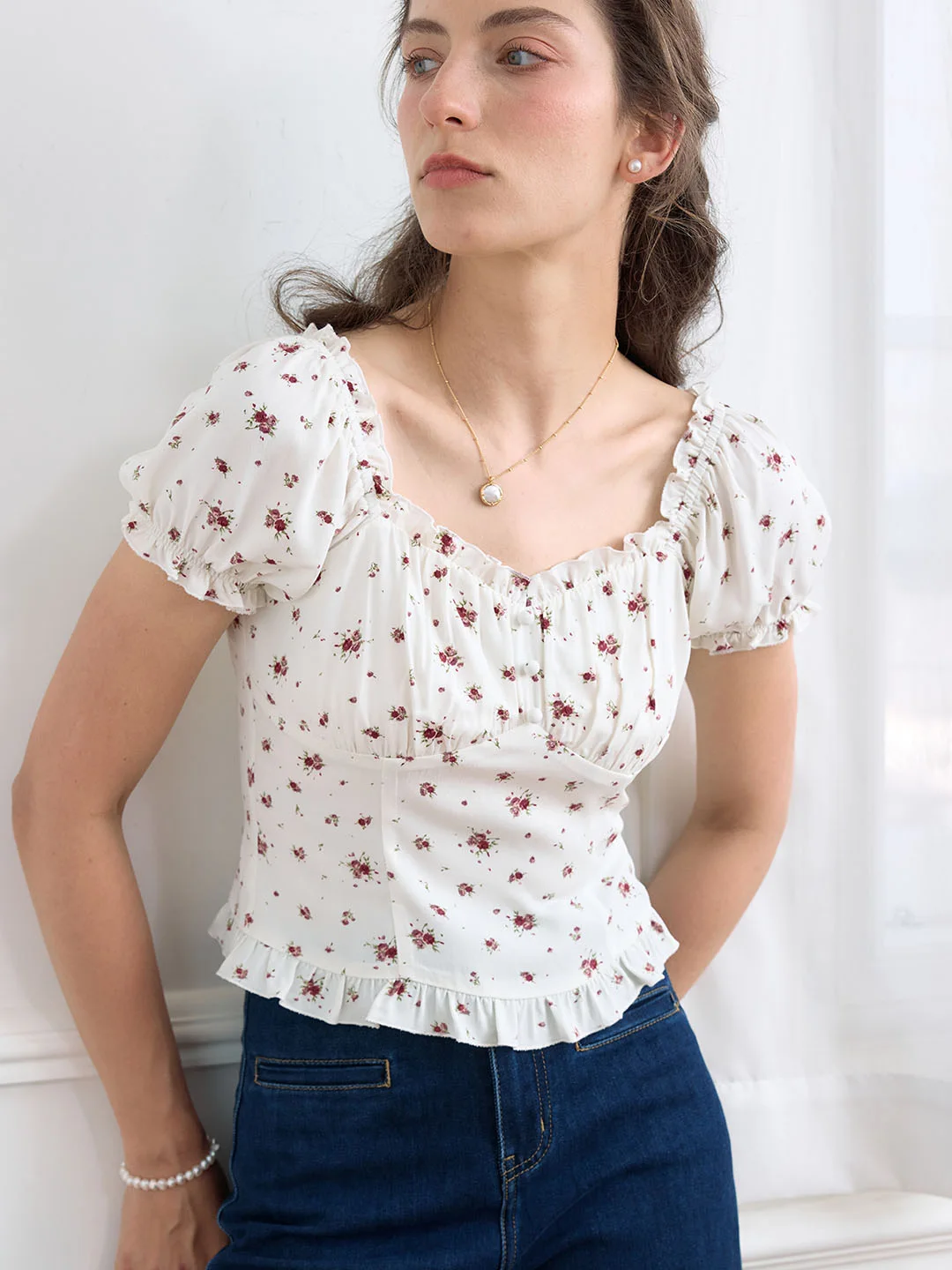
Patterns are powerful but they complicate mixing. Narrow your pattern choices to two families: one small-scale (stripes, ditsy florals) and one larger or graphic (checks, bold floral). Make sure both pattern families use your neutrals plus one accent to ensure cohesion.
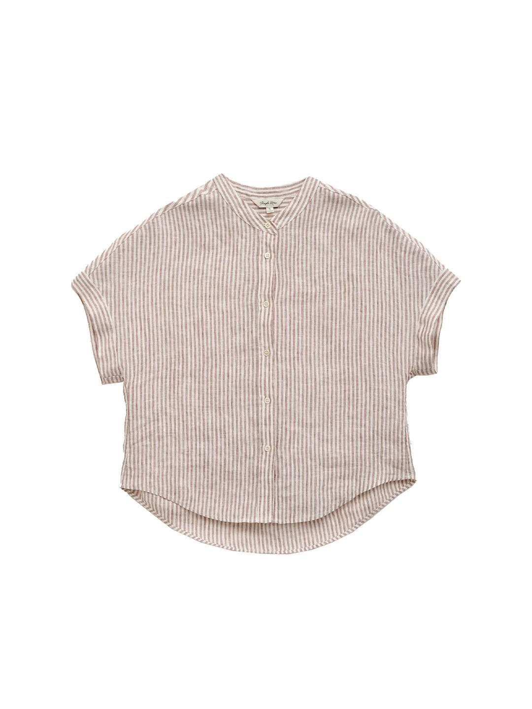
- Concrete pairing: a small navy-and-cream stripe blouse with a moss-green cardigan and camel skirt.
- Trade-off: too many large patterns in a small wardrobe can limit outfit combinations; rotate patterned garments seasonally or in and out of stock for shops.
- Product placement: pair patterned tops like the Octavia blouse with solid bottoms in the palette to show versatility.
Decide on Warm or Cool Dominance
Colors read as warm (mustard, rust, camel) or cool (navy, teal, charcoal). Choose a dominant temperature to avoid constant accidental clashing. That doesn’t mean excluding the opposite temperature entirely—small accents, accessories, or shoes can bridge the gap—but the majority of your wardrobe should follow the chosen temperature.
- Everyday example (warm-dominant): camel coat, cream knit, rust skirt, and chocolate-brown boots.
- Boutique buying example (cool-dominant): navy trousers repeated across fabrications, teal blouses for accent, charcoal outerwear.
- Trade-off: if you prefer equal warm and cool pieces, adopt a neutral bridge (cream or gray) to ground outfits.
Layering Strategy: Use Color to Structure Outfits
Layering is essential for vintage-inspired looks. Let color act as the structure: base (light neutral), middle layer (accent or neutral), and outer layer (contrasting neutral). This creates visual depth without relying on bold prints.
- Concrete outfit: cream camisole, olive-green cardigan, charcoal blazer, and a retro red scarf for a focal point.
- Retail display tip: show the same base top with multiple middle layers on a single rack to demonstrate mix-and-match possibilities to customers.
- Trade-off: too many layers in similar tones can read flat—introduce one textural contrast (e.g., velveteen vs. wool) to prevent monotony.
Think About Occasion and Practicality
Different colors suit different parts of life. Reserve easy-care, darker hues for high-use items like trousers and outerwear; lighter, more delicate tones can be for blouses and weekend garments. For US women balancing errands, work, and social life, aim for at least one outfit per common occasion that uses only pieces from your palette.
- Practical set: navy jeans, cream blouse, and a rust overshirt for school drop-off or casual Friday.
- Shop buyer example: stock durable dark neutrals in heavier fabrics and lighter neutrals in seasonal quantities for blouses and dresses.
- Trade-off: light-colored garments sell well but require more care; always advise shoppers to check the sewn care label first for laundering instructions.
Add Signature Pieces That Anchor the Palette
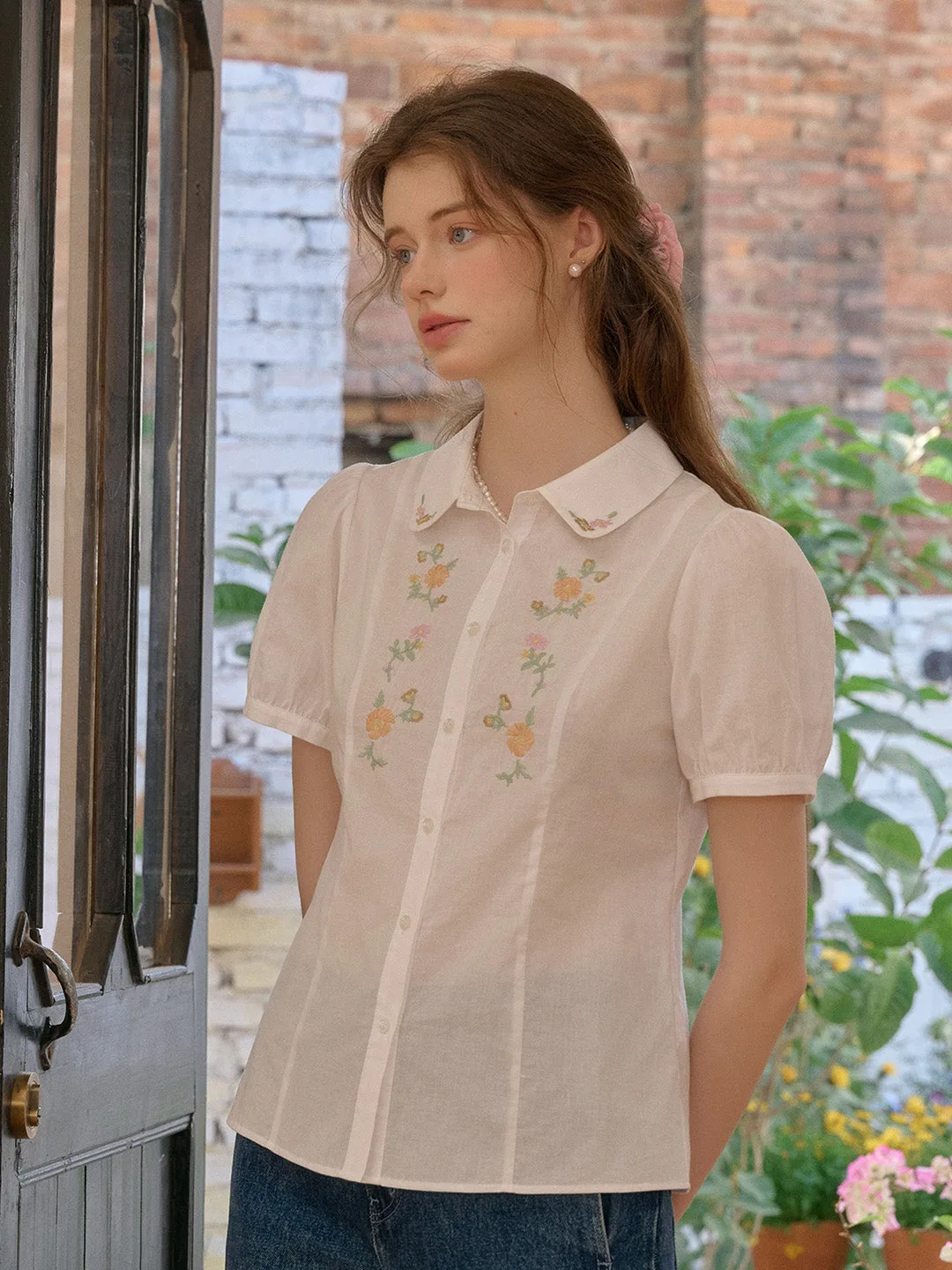
A signature piece is a recurring item that customers and you will return to—an embroidered blouse, a particular coat shape, or a distinctive knit. Pick one or two signature items in a standout color that complements your neutrals. These become visual anchors and sales drivers.
- Example for wardrobes: a velveteen shirt in green like the Hesper velveteen shirt worn with camel trousers and a cream belt.
- Wholesale approach: offer signature pieces in two colors — one neutral, one accent — so customers can choose their comfort level.
- Trade-off: signature items can overshadow basics if they’re too loud; reserve them for focal points (tops, coats) rather than the entire collection.
Use Accessories to Test or Temper Color Choices
Accessories are low-risk ways to broaden a palette. Scarves, belts, socks, and bags let you experiment with more saturated or unexpected hues without committing to full garments. They also help customers visualize combinations.
- Everyday outfit tweak: add a mustard scarf to a navy-and-cream outfit to warm the look for transitional weather.
- Retail merchandising: display accessories adjacent to core apparel items so shoppers can see how they alter mood and balance of an outfit.
- Trade-off: accessories can feel like afterthoughts if not coordinated; include one or two pieces in store displays to show intentionality.
Visual Merchandising and Photography Tips
How you show clothing affects perceived palette cohesion. Use consistent backdrops and natural light when photographing pieces so colors read accurately. When styling outfits for product shots or in-store mannequins, stick to your three-to-five color palette and show at least three fully realized outfits that reuse the same pieces.
- Concrete example: photograph the Madeleine wool top with camel trousers and a rust scarf, then with navy skirt and cream cardigan to show range.
- Trade-off: mixed lighting can alter tones online; in captions or product copy, mention how the garment appears in natural light and suggest pairing options.
- For size-conscious shoppers: include links to our size guide and show how colors fit on multiple body types.
Maintain Flexibility: Seasonal Swaps and Reorders
A wardrobe that’s actually used changes with the seasons. Keep your core neutrals year-round and rotate accents seasonally—mustard and rust in fall, teal and coral for spring. For boutique buyers, reorder accents only after checking sell-through and customer feedback; keep basic neutrals steady to avoid gaps in outfit-building options.
- Retail workflow: when adding a new accent, order a small test run and promote it with styling suggestions to see if it integrates into existing customer wardrobes.
- Trade-off: constantly changing colors can confuse customers; announce seasonal additions clearly and show how they pair with existing stock.
- If you need help or want to place orders, please reach out via our contact page — website orders are processed by email requests and confirmed in writing.
Putting together a wardrobe color palette you will actually use is a practical exercise in limits and options: pick reliable neutrals, add one or two accents, choose patterns that play together, and test new hues with accessories. For shops, apply the same discipline: keep core colors in stock, test accents in small runs, and use styling and photography to demonstrate mix-and-match potential. If you’re considering wholesale, we provide pricing, minimums, and lead times on inquiry through wholesale — contact us to request availability and shipping/payment terms. And for product-specific pairing ideas, browse our tops collection at blouses and tops or explore the full collection at clothing collection.
One final practical note: fabric care varies widely — always check the sewn care label first before laundering or dry-cleaning any piece. Thoughtful color choices plus proper care keep your favorite garments looking like they belong together for seasons to come.
Explore the pieces behind the ideas
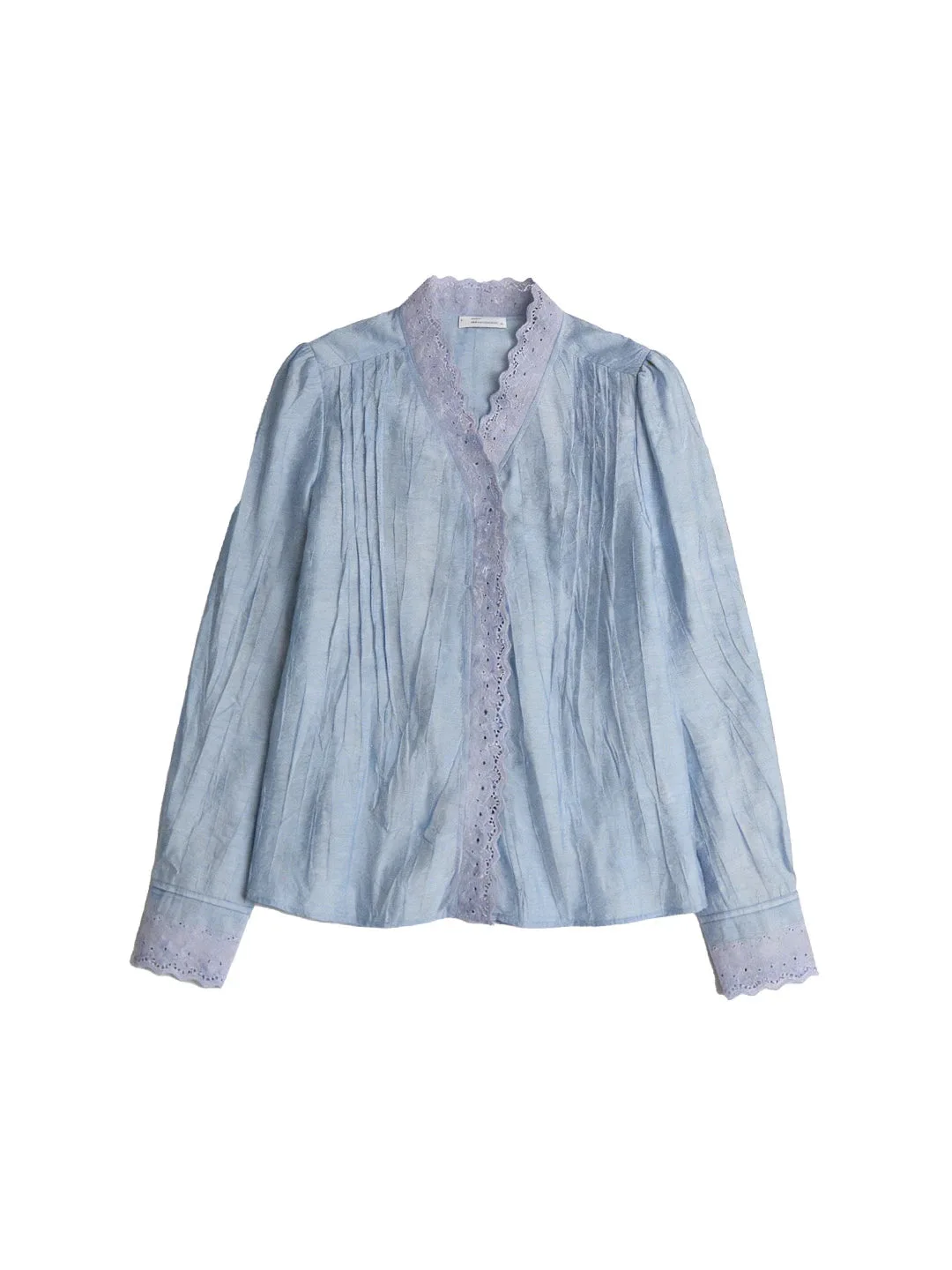
Browse our blouses & tops for full product photographs and listed specifications. Ask our team for fit and availability, or visit wholesale partnerships if you’re buying for a boutique.